
|
1/20/2015 0 Comments Decorating: Gray is the New BlackIf the color gray brings to mind childhood memories of staring out a window on a dismal day waiting for the sun to return, dotty elders, bankers’ suits, or some vague, intermediate area, it may be time for a new appraisal. In home furnishings at least, gray has broken free of its dreary associations and shot to No. 1 with a bullet. Gray—in all its shades—is hot! “Dark gray, mid-gray, light gray, if it’s gray, it’s topping the charts,” relates one color expert, a comment echoed by Contemporary Design Group members across the board. In upholstery, where trend forecasters report that rounded, curvy silhouettes are getting more attention than designs with sharp angles or square corners, gray is now considered the “new neutral.” In wood furnishings, where walnut is ruling the day, gray-toned woods appear to be gathering momen- tum. And, in metal finishes, the most in-demand looks span silvery gray shades like brushed chrome, steel and platinum. 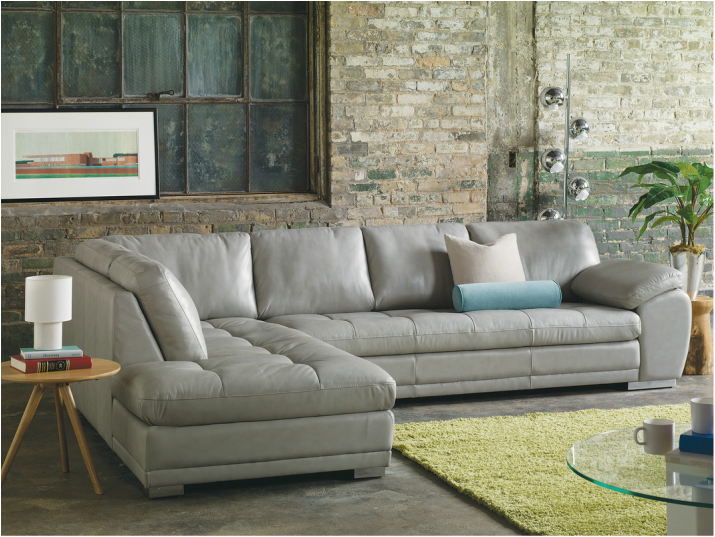 We Gotcha Covered Gray or not, neutral upholstery continues to hold sway in Contemporary Design Group member showrooms across the country. “Neutral fabric—grey, black, brown, khaki, beige, ivory and even some navy and greens—make the clean lines of a contemporary sofa or sectional frame stand out; you can really see the design. It’s just an easier read,” says one designer. “Then, we like to pop it with color.” In fact, design experts suggest starting with a neutral base in an investment piece like a sofa or sectional and then layering in color with pillows, accessories, artwork and accent chairs, can be a smart and cost-effective way to remain on fashion’s leading edge. Then, as trends come and go, whether the “it” shade is purple (Pantone’s anointed color this year is Radiant Orchid), fuchsia, egg- plant, blue, turquoise, aqua, teal, green, red, yellow, or- ange or pink, or you are simply in the mood for a change, updating your look is quick and easy. An even smarter move for many shoppers now is opting for something in the relatively new class of high-performance fabrics. With brand names like Sunbrella, Crypton, Brisa and Ultrasuede, and durable, high-tech constructions like microfiber, easy-care performance fabrics guard against stains and wear, look great and feel just as good. Accidents happen, and performance fabrics are a boon for open- plan spaces where food and drinks are consumed, and for those sharing spaces with children and pets. Here’s Your Cue Shoppers seeking inspiration and information about what may be trending in contemporary design have more sources than ever for great ideas and style cues. Websites like Pinterest and Houzz, the Twitter feeds of celebrity and professional designers, as well as other home furnishings experts, home-related cable channels like HGTV, shelter magazines and publications, and of course, the imaginatively merchandised, trend-setting and ever-changing showrooms of Contemporary Design Group member stores. In addition to the fashions in your closet, look around at the places you love most. The combination of colors in nature are fantastic and places you gravitate to may hold clues to your favorite palettes. Personal taste dictates what’s going to work well and what you will value in the long term. As one standout design talent notes, “You are the one who will live with it, so go with your gut instinct!” 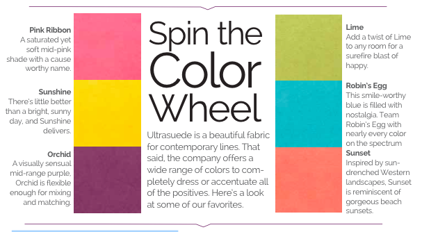
0 Comments
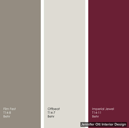
By Jennifer Ott, Jennifer Ott Interior Design for Houzz.com Rather than tie itself to one top color of the year for 2014 as Pantone, Benjamin Moore, Sherwin-Williams and Pittsburgh Paints have done, Behr has offered up a whole slew of them. There are 20 colors featured in four collections: Seaside Harmony, a crisp and modern palette of cool blues and greens combined with soft warm neutrals; Urban Alternative, a palette of deep, dramatic and sophisticated hues; Grand Reign, a classic palette that has old-world charm; and Natural Avocation, a fun mix of superbold hues. I’ve assembled a few of my favorites below, along with images and tips for how to work them into your own home. Ocean Liner is from Behr’s Seaside Harmony collection. It’s a fetching turquoise that has a hint of gray, which gives it a subdued quality.  In this image from Behr, you can see that although Ocean Liner is quite vibrant, it has a slightly muted quality that allows it to be featured on all four walls in a room without overwhelming the space with color. I would pair this watery blue with other hues from nature — a soft sunshine yellow and a fresh, herbaceous green. Any of these hues would be terrific on the walls or ceiling, with the other two colors used as accents.  New Shoot is from the Natural Avocation collection and is an intense grass-green hue. There’s nothing muted about this high-impact shade, so you might want to use it sparingly as an accent only. New Shoot might be too intense to use on all four walls, but it’s a fun accent color, as shown here on the coffee table. New Shoot requires some neutral hues to tone it down, unless you are going for a supercolorful space. But neutral doesn’t have to mean white, beige or gray. A deep, dark, toned-down blue or a supersoft sage are good choices. The grounding neutrals provide a nice backdrop to the more assertive bold green.  If Ocean Liner and New Shoot are too bold for you, check out some of the interesting neutral hues from Behr’s Urban Alternative line. Increasingly I’m hearing from homeowners who want to move away from expected shades of white, cream and beige and toward more complex neutrals that have a mix of brown and gray. Film Fest and Offbeat are two such neutral hues that straddle the line between warm and cool neutrals. These warm-cool hybrids really vary throughout the day. In the cooler morning light they will appear more gray, but will take on a richer, warmer tone in the warmer afternoon light. The best thing about using a neutral background hue in a room is that you can add accents of any other color you like. Or use a variety of neutral hues, as shown here, for a layered look that’s visually interesting without hitting you over the head with color. Neutral does not have to mean boring. Mix up your muted hues by playing with contrast. Consider a light warm or cool neutral as a base, such as Offbeat or Twilight Gray, and then add a darker neutral, such as Film Fest. This will give you swaths of varying soft colors, which will offer a bit more punch than sticking with one neutral throughout the entire space. 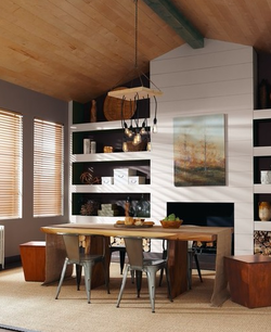 This beautiful saturated hue is my favorite of the Grand Reign colors. Imperial Jewel is a deep garnet that will add a nice dash of drama. Imperial Jewel works well with a variety of design styles, from the traditional office space shown here to transitional or contemporary interiors. For a more traditional look, pair it with warm neutrals and dark wood tones. For a more modern look pair, it with gray, white and/or black. Here are Film Fest and Offbeat again, but this time the two neutral hues are paired with the deep, dramatic Imperial Jewel. If you want to keep your space light and open, use Offbeat as the primary color, with accents of the other two hues. For more drama use one of the darker colors for your walls or ceiling, but consider balancing the dark colors with plenty of light — natural and artificial, unless you are going for a supercozy and intimate space.
12/31/2013 0 Comments 2014: The Year of Radiant Orchid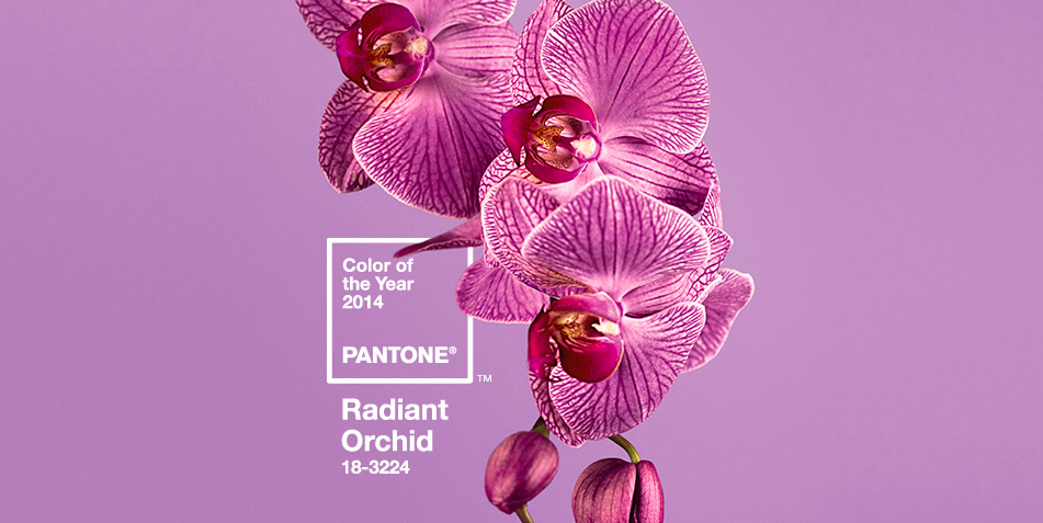 It's official! 2014 will be all about "Radiant Orchid" #18-3224, according to the color authorities at PANTONE®
They've been predicting the hottest color trends for over a decade and are considered the leaders in professional color standards for the design industry. Leatrice Eiseman, executive director of the Pantone Color Institute®. describes this year's shade as "An invitation to innovation, Radiant Orchid encourages expanded creativity and originality, which is increasingly valued in today's society. An enchanting harmony of fuchsia, purple and pink undertones, Radiant Orchid inspires confidence and emanates great joy, love and health. It is a captivating purple, one that draws you in with its beguiling charm.” We expect to see Radiant Orchid appear on the interior design stage in accessories, accents, and wall color--livening up neutrals with a warm rosy glow. PANTONE® notes that the hue is universally flattering to skin tones, reflecting a healthy glow on both men and women. And seriously, who doesn't want a room that makes you look good just by living in it, right? |
About UsContemporary Design Group is a national association of independent contemporary furniture retailers. Archives
June 2015
CategoriesAll Accessories Circle Furniture Color Contents Interiors Design Dining Forma Furniture High Point Market Hillside Furniture Houzz.com Houzz.com Lawrance Furniture Lifestyle Makeover Mid Century Modern Mid-century Modern Milo Baughman Office Organize Perlora Pets Skandinavia Sklar Furnishings Suburban Contemporary Thayer Coggin Thayer-coggin Tips And Tricks Ultrasuede Our Blog RollWho we're following! |
Search by typing & pressing enter
 RSS Feed