|
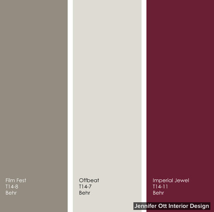
By Jennifer Ott, Jennifer Ott Interior Design for Houzz.com Rather than tie itself to one top color of the year for 2014 as Pantone, Benjamin Moore, Sherwin-Williams and Pittsburgh Paints have done, Behr has offered up a whole slew of them. There are 20 colors featured in four collections: Seaside Harmony, a crisp and modern palette of cool blues and greens combined with soft warm neutrals; Urban Alternative, a palette of deep, dramatic and sophisticated hues; Grand Reign, a classic palette that has old-world charm; and Natural Avocation, a fun mix of superbold hues. I’ve assembled a few of my favorites below, along with images and tips for how to work them into your own home. Ocean Liner is from Behr’s Seaside Harmony collection. It’s a fetching turquoise that has a hint of gray, which gives it a subdued quality. 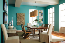 In this image from Behr, you can see that although Ocean Liner is quite vibrant, it has a slightly muted quality that allows it to be featured on all four walls in a room without overwhelming the space with color. I would pair this watery blue with other hues from nature — a soft sunshine yellow and a fresh, herbaceous green. Any of these hues would be terrific on the walls or ceiling, with the other two colors used as accents. 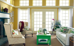 New Shoot is from the Natural Avocation collection and is an intense grass-green hue. There’s nothing muted about this high-impact shade, so you might want to use it sparingly as an accent only. New Shoot might be too intense to use on all four walls, but it’s a fun accent color, as shown here on the coffee table. New Shoot requires some neutral hues to tone it down, unless you are going for a supercolorful space. But neutral doesn’t have to mean white, beige or gray. A deep, dark, toned-down blue or a supersoft sage are good choices. The grounding neutrals provide a nice backdrop to the more assertive bold green.  If Ocean Liner and New Shoot are too bold for you, check out some of the interesting neutral hues from Behr’s Urban Alternative line. Increasingly I’m hearing from homeowners who want to move away from expected shades of white, cream and beige and toward more complex neutrals that have a mix of brown and gray. Film Fest and Offbeat are two such neutral hues that straddle the line between warm and cool neutrals. These warm-cool hybrids really vary throughout the day. In the cooler morning light they will appear more gray, but will take on a richer, warmer tone in the warmer afternoon light. The best thing about using a neutral background hue in a room is that you can add accents of any other color you like. Or use a variety of neutral hues, as shown here, for a layered look that’s visually interesting without hitting you over the head with color. Neutral does not have to mean boring. Mix up your muted hues by playing with contrast. Consider a light warm or cool neutral as a base, such as Offbeat or Twilight Gray, and then add a darker neutral, such as Film Fest. This will give you swaths of varying soft colors, which will offer a bit more punch than sticking with one neutral throughout the entire space. 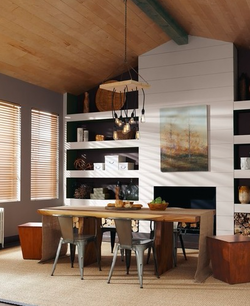 This beautiful saturated hue is my favorite of the Grand Reign colors. Imperial Jewel is a deep garnet that will add a nice dash of drama. Imperial Jewel works well with a variety of design styles, from the traditional office space shown here to transitional or contemporary interiors. For a more traditional look, pair it with warm neutrals and dark wood tones. For a more modern look pair, it with gray, white and/or black. Here are Film Fest and Offbeat again, but this time the two neutral hues are paired with the deep, dramatic Imperial Jewel. If you want to keep your space light and open, use Offbeat as the primary color, with accents of the other two hues. For more drama use one of the darker colors for your walls or ceiling, but consider balancing the dark colors with plenty of light — natural and artificial, unless you are going for a supercozy and intimate space.
0 Comments
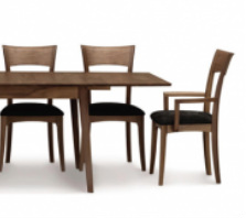
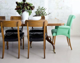
When it comes to fireboxes, homeowners seem to be gravitating to fire ribbons — gas flames that are wide but shallow, appearing literally as ribbons of fire. The look is contemporary but minimalist, with no faux logs. Instead flames rise from rock, sand or glass. The idea isn’t to provide the illusion of a wood-burning fireplace, just to add the warmth and beauty of a flickering flame. Architects, interior designers, and more ∨ Whether granite countertops, a custom kitchen island, or a built-in wine rack are new kitchen musts, discover thousands of kitchen designs to help make your dream come true. Find inspiring decorating ideas, from tufted headboards designs to custom window treatments, to help you redesign your bedroom. This article is courtesy of our CDG store LaDifférence in Richmond, VA. Check out more great articles from LaDifférence at www.blog.ladiff.com and follow them on Pinterest at www.pinterest.com/ladiff Convinced that your dining room needs to have a formal feeling with beige walls, classic wood finishes, tied together with an unobtrusive color palette, and a traditional suite like this one. We do love that classic look, but we think it’s time to rethink your dining room philosophy and visit the idea of mixing and matching. Recently we’ve noticed a shift in design thinking and mixing patterns, colors, textures, and styles is not only common, but encouraged! We love this idea because it gives you a chance to play with your favorite hues, different touches, and combine styles, all whilst uninhibited by “matchy-matchy” elements. This being said, there is a fine line between tastefully calculated combinations and all-out eyesores. You can mix modern with traditional, vintage with new, whimsical with antique, and as long as it shows off your personality, it will work! Proportion, scale, and color become the more important parameters: not ‘match, match, match.’ Here are some of our favorites that we think do a pretty good job. And be sure to check out our Pinterest Board for all our favorite mixed and matched styled rooms. |
About UsContemporary Design Group is a national association of independent contemporary furniture retailers. Archives
June 2015
CategoriesAll Accessories Circle Furniture Color Contents Interiors Design Dining Forma Furniture High Point Market Hillside Furniture Houzz.com Houzz.com Lawrance Furniture Lifestyle Makeover Mid Century Modern Mid-century Modern Milo Baughman Office Organize Perlora Pets Skandinavia Sklar Furnishings Suburban Contemporary Thayer Coggin Thayer-coggin Tips And Tricks Ultrasuede Our Blog RollWho we're following! |
Search by typing & pressing enter

 RSS Feed